How to Decorate Your Home with 2023 Color Trends

Color trends transcend across a multitude of industries, from fashion and beauty to marketing and design, and our favorite, home décor! Every year, the Pantone Color Institute and paint manufacturers look at color influences, culture, and the world around them to forecast color trends, thus naming their annual Color of the Year – and we are excited about the color trends for 2023, which range from earthy and natural to bold and empowering!
Curious to learn more about 2023 color trends? We've compiled design inspiration from color experts and our own interior designers to show you how you can incorporate the 2023 Colors of the Year into the décor of your new home in Florida!
Pantone Color of the Year 2023
Powerful. Joyous. Optimistic. Fearless. Introducing Pantone’s 2023 Color of the Year, Viva Magenta! This bold, red-toned hue strikes a perfect balance between cool and warm, pink and red, and is an optimistic and electrifying celebration of color.
Red is considered a color of power, strong emotions, and love. It is warm and energizing, and often associated with passion and confidence - aka, colors in the red family are head-turners!
Executive Director of the PANTONE Color Institute, Leatrice Eiseman, says, “In this age of technology, we look to draw inspiration from nature and what is real… Rooted in the primordial, Viva Magenta reconnects us to original matter. Invoking the forces of nature, Viva Magenta galvanizes our spirit, helping us to build our inner strength.”
Pantone’s Color of the Year is meant to empower while “welcoming anyone and everyone with the same verve for life and rebellious spirit.” Pantone continues to describe Viva Magenta as an “animated color that revels in pure joy, encouraging experimentation and self-expression without restraint.”
Decorating with Viva Magenta
This powerful, alluring hue makes a big statement, which means a little goes a long way. When using Viva Magenta in the décor of your new home in Florida, consider accents such as a striking piece of furniture, textiles, or beautiful floral arrangements.
“I really love how vibrant this Color of the Year is,” said Stacey Antonakas-Perez, Highland Homes Design Center Manager and Lead Designer. “Using it as an accent adds a fun pop of color, particularly in bedrooms and gathering rooms. It pairs well with neutral beiges, grays, greens, or whites, and the addition of mixed metals elevates it to a great glam look.”
Complement and Contrast
Like Stacey mentions, when using an electrifying color like Viva Magenta, keep the rest of the room neutral so the magenta stands out without overwhelming. Bold magenta is best complemented by:
- Shades of green with warmer undertones, such as Pantone’s Pale Khaki, Fields of Rye, or Agate Gray for a true grey-green option;
- Bright white or bold black, providing maximum contrast and a dash of personality;
- Greys for a touch of cool, chic contrast that you’re sure to love.
In addition to colors, Viva Magenta pairs beautifully with dark woods, gleaming glam gold accents, and warm lighting. If you're using a magenta sofa or chair, we love pairing it with a white or grey patterned throw pillow and rug.
Flora and Fauna
And it's not just a vibrant color to be used indoors - Magenta comes from nature! Flowers such as impatiens, azaleas, and hibiscus, and flowering trees such as the Florida-favorite crape myrtle, all bloom in bright magenta hues and are ideal for spicing up your landscaping, providing a beautifully rich contrast against the vibrant greens found in your yard. Carry the color onto your porch or lanai with potted or hanging floral arrangements, or even add boldly-colored and patterned throw pillows to your outdoor furniture!
And, bring the same bold blooms indoors with floral arrangements - faux or real - adding a pop of eye-catching color to your dining and accent tables.
Sherwin-Williams Color of the Year 2023
The color experts at Sherwin-Williams, the industry-leading paint brand used in our new homes in Florida, also selected a color in the red family featuring pink undertones, warmth, and inspiration from nature – though their Color of the Year pick, Redend Point (SW 9081), evokes an entirely different look of minimalism and earthiness.
With the selection of this soft, calming color for 2023, the Sherwin-Williams team hopes you will feel cared for, appreciate what you have, and create deeper connections in your life. After a long period of feeling isolated from our neighbors and loved ones, the team felt “inspired by the deep care it felt for its communities, its connections, and its crafts.”
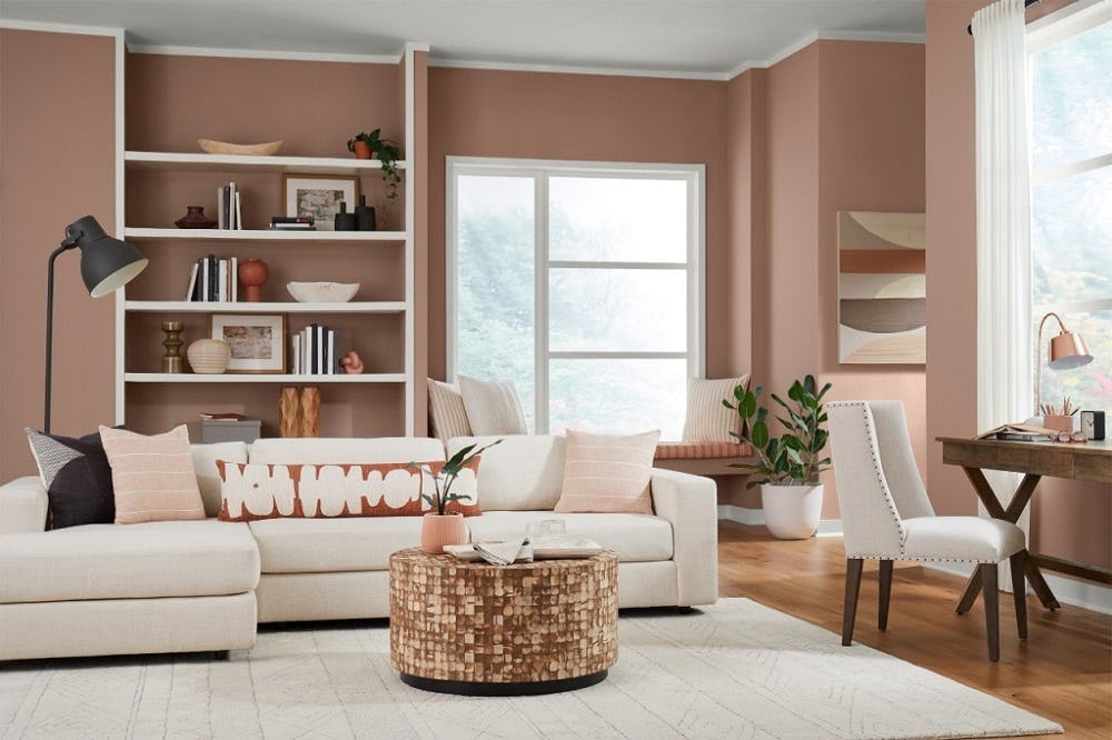
Redend Point, described as a soulful-yet-subtle hue, creates a comforting backdrop for your daily life. Featuring blush and beige undertones, this inviting neutral instantly incorporates warmth into any space and is reminiscent of soft clay or sand, making it a great color for Florida home decor!
Decorating with Redend Point
With its warm, earthy, neutral tones, Stacey is excited about the versatility offered by the Sherwin-Williams Color of the Year.
“Grays were popular for the last several years,” says Stacey. “It’s nice to see a warm color trending for décor, and I can foresee this being popular both for interior and exterior paint.”
Its versatility also means it’s an ideal color choice for a variety of decor styles, from traditional to coastal, boho to modern, and glam to farmhouse.
Complementary Colors
Redend Point offers ample versatility in where it can be used. Since it is a neutral tone, it can be used to paint a whole room, or even as an exterior paint color for your Florida home. Alternatively, you may choose to use it as an accent wall or for textiles.
The coordinating color palette for Redend Point includes complementary earth tones:
- Choose from other soft beiges for a simple color palette;
- Opt for the contrast offered by green hues such as Evergreen Fog (the 2022 Color of the Year) or Rookwood Dark Green;
- Or, add warmth with rich reds such as Baked Clay, Cavern Clay, or Smoky Salmon.
Pair with Natural Elements
It’s no surprise that this earthy tone pairs well with natural elements. In fact, using nature-inspired accents with Redend Point may be one of our design team’s favorite ways to decorate with this color!
“I love pairing this with natural-fibered textiles, rattan, and wood,” says Stacey. “Light-colored woods create a soft look, while dark woods and metals pop against this muted tone. And, add in some live greenery for a true oasis.”
High Style and Shine
Going for glam? Amp up your interior by mixing metallic accents with Redend Point and achieve a high-style look. Search for luxe light fixtures, gilded mirrors or frames, or textiles with metallic threads for an upscale twist with this blushing beige.
Additional Colors of the Year
Pantone and Sherwin-Williams aren’t the only design and paint companies to select Colors of the Year. The trend has grown since Pantone started it in 1999 – so much so that now nearly every major paint manufacturer predicts a color they expect to dominate the world of fashion and design!
When we look at all the Colors of the Year for 2023, it’s easy to identify a few trends in the predictions:
- Bold, back-to-nature greens, with the selection of Spanish Moss by Krylon and Vining Ivy by Glidden.
- Bright berry colors abound, with Benjamin Moore’s Raspberry Blush and Terra Rosa by Dunn-Edwards, in addition to Pantone's Viva Magenta.
- Earthy beige options provide a flexible background for any design taste, with Sherwin-Williams' Redend Point, Canyon Ridge by Better Homes & Gardens at Walmart, and Dutch Boy’s Rustic Greige.
The varied 2023 Colors of the Year illustrate that this year is truly about self-expression. Simply put, when it comes to the color scheme of your home, gone are the days of every home being painted in only whites and greys – color is back!
Decorate Your Florida New Home with the 2023 Colors of the Year
Searching for more inspiration on how to use 2023’s Colors of the Year in your home décor? We've compiled some decor ideas on Pinterest, and our online Inspiration Gallery showcases a wide variety of home décor and design ideas - both in trending colors and more classically-toned hues - from our new homes in Florida.
Need to find a new home before you can start decorating? Browse our Florida new home communities, along with helpful tips on owning and designing your dream home, and call or email us to connect with a Florida New Home Specialist today!
Tags: Color of the Year Decorating tips Design trends Paint colors
Article Search
Categories
- Communities (150)
- - Aviary at Rutland Ranch (8)
- - Bennah Oaks (2)
- - Bentley North (3)
- - Bradbury Creek (2)
- - Bridgeport Lakes (7)
- - Copperleaf (3)
- - Cypress Ridge Ranch (2)
- - Enclave at Lake Myrtle (3)
- - Falls of Ocala (4)
- - Gardens at Lancaster Park (3)
- - Geneva Landings (4)
- - Gracelyn Grove (6)
- - Hammock Reserve (3)
- - Harbor at Lake Henry (4)
- - Jackson Crossing (4)
- - Lakeside Preserve (4)
- - Myrtlebrook Preserve (1)
- - Otter Woods Estates (2)
- - Ridgewood (7)
- - Silver Springs Shores (2)
- - Stonebridge at Chapel Creek (10)
- - Summercrest (5)
- - Summerlake Estates (1)
- - Terrace at Walden Lake (5)
- - The Crossings (5)
- - The Lakes (7)
- - VillaMar (6)
- Design and Decorating (66)
- En Espanol (2)
- General Info (78)
- Home Buying 101 (49)
- Homeowner Tips & Info (16)
- News (225)
- Pet Friendly Homes & Communities (14)
- The Experience of Building My Highland Home (10)
- Why Buy New (31)
Recent Posts
7 Reasons to Move to St. Cloud, FloridaNow Selling New Homes in Zephyrhills, FL
5 Desirable Towns Near Tampa You Will Want to Relocate to in 2025
Coming Soon: New Homes in Lakeland, FL at Myrtlebrook Preserve
Grand Opening of New Model Home in Winter Haven, Florida


 Equal Housing