How to Decorate Your Home with 2025 Color Trends

It’s our favorite time of year - Christmas is around the corner, New Year’s is near, and paint manufacturers have revealed their picks for the 2025 Color of the Year!
Color experts from paint and design companies each name their own pick for what they expect to trend in design, and 2025 is all about rich hues, with top color trends including regal purples, warm browns, and moody blues.
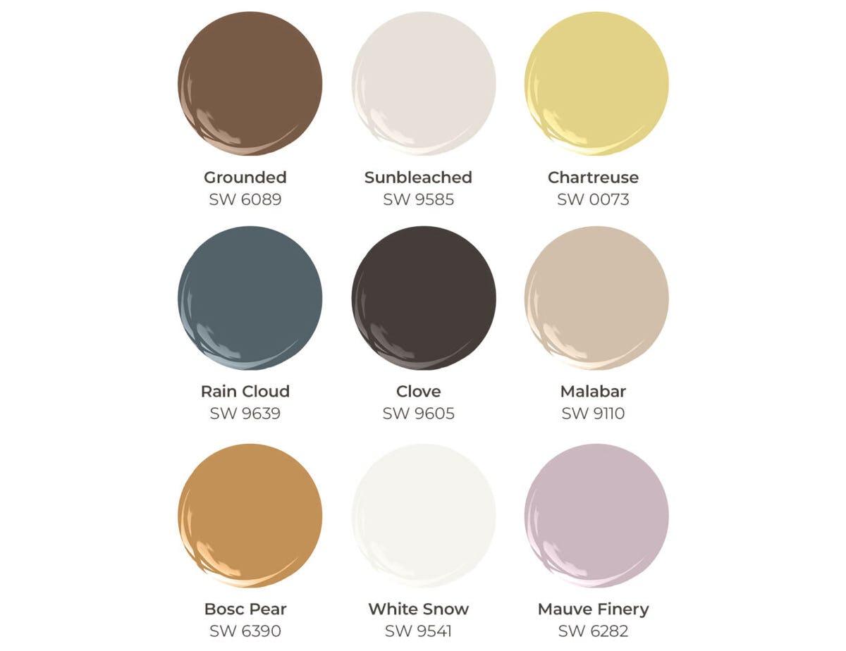
For 2025, the color experts at Sherwin-Williams, the industry-leading paint brand used in our new construction homes in Florida, are making it easier than ever for you to experiment with color. Instead of selecting a single color of the year, Sherwin-Williams created the 2025 Color Capsule of the Year, a color palette of nine curated hues designed to mix and match, resonate with diverse design preferences, and showcase your unique style and story through color.
Join us as we dive into how to incorporate Sherwin-Williams’ 2025 interior paint colors into your home decor!
Sherwin-Williams’ 2025 Color Capsule of the Year

With the goal of reimagining the Color of the Year as an impactful celebration of how color and design affect our mental and physical well-being, colors in the 2025 Color Capsule of the Year were specially selected to work together, whether as a whole palette or color pairings. Combining essential classics, vintage vibes, and bold, modern hues, the end result is a warm, welcoming color palette, offering countless possibilities for decorating your space.
Grounded (SW 6089)
A rich earthen brown made to envelop spaces in comfort, use it as an all-over wall color for a nature-inspired or a mid-century modern look, use it on an accent wall, or use it as an accent color above or below a chair rail. Balance this rich color with lighter tones either in furnishings or complimenting paint.
Thanks to its earthen tone, it pairs ideally with all of the Capsule colors. We particularly like it paired with:
- Warm white or beige neutrals (Sunbleached, White Snow, and Malabar) as a complimenting paint;
- Cool moody blue accents in Rain Cloud;
- Warm, vintage and mid-century accent furniture in Bosc Pear.
Sunbleached (SW 9585)
Light and airy, elegant and versatile, Sunbleached is the perfect color to create a warm, elegant space. This neutral paint color balances warm and cool tones - It’s not quite white, not quite gray, and incorporates hints of beige and taupe. It can be used as the base of any décor style from rustic farmhouse to minimalistic Scandinavian design.
Ideally suited as a main wall color and with luminosity to make spaces feel larger, pair it with any accent color of your choice. Thanks to its sunny nature, we love adding textile fibers such as chunky knitted throws, linen upholstered furniture, and wool rugs to enhance its warm vibes.
Seeking a dramatic look? Pair with contrasting Clove for a modern take on not-quite black and white.
Chartreuse (SW 0073)
As part of the Historic color line, this lively yellow-green is eclectic and versatile, it reflects energy and creativity, and undoubtedly makes a statement! Ideally suited as an accent, use this color for a bold accent wall, or for accent pieces like pillows and lamps.
Chartreuse pairs well with:
- Dark woods;
- Light metallics and reflective materials like glass;
- Rich textures such as velvet;
- Moody blue-gray tones, such as Rain Cloud.
Rain Cloud (SW 9639)
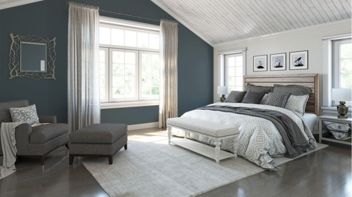
Rustic and refined, this deep gray-blue evokes a moody yet tranquil atmosphere and is a breath of fresh air in any room of your home.
Its distinctive gray tones work with varied décor styles and make it neutral enough to be used as an all-over interior paint color, paired with white trim and ceiling paint, or as an accent color. Because it combines blue and gray tones, the appearance will be influenced by lighting and the colors around it. For example, more natural lighting will make the color softer and warmer, whereas rooms with less light might appear more cool.
Blue is known as a calming color, so we particularly love Rain Cloud in bedrooms and bathrooms. It’s also great in a home office, meditation, or workout room, emanating zen vibes. We love to pair it with white baseboards and furniture, metals like brushed nickel, darker monochromatic blues, and light natural woods.
Clove (SW 9605)
Dark and dramatic, Clove is a warm take on traditional black – it’s actually part of Sherwin-Williams Warm + Welcoming Designer Color Collection. Bright natural lighting will warm up this dark brown-black color, while cool and evening light will make it darker.
In your living area, create a moody, dramatic space, inviting bright and artistic accents - use it as an all-over color, paired with white baseboards and ceilings, or use it on an accent wall or above or below a chair rail. We wouldn’t suggest this color in small rooms because it does not reflect much light, making small spaces feel even smaller - With that said, we love it in a powder room for its moody feel.
As an alternative to wall paint, Clove is a great color for painted cabinets and furniture.
Pair Clove with:
- Neutral beige and warm brown tones;
- Bright pops of color in any tone you love – from this palette, we love Chartruese and Bosc Pair;
- Creamy white linens and accents;
- Rustic metal, wood, and leather furniture and accent pieces.
Malabar (SW 9110)
Warm and inviting, any room in your home is a haven in Malabar. This versatile sandy beige warm-neutral is ideal for combining with other warm hues, from lighter neutrals to dramatic pinks, as well as browns such as Grounded. It can be used as your main paint color or an accent color.
Pair with rich woods for a traditional look, or natural fibers and materials for more rustic décor.
Bosc Pear (SW 6390)
This golden yellow with earthy undertones evokes vintage vibes. We like this color for its Art Deco ambiance, and it also works in farmhouse style and modern décor.
Ideally suited as an accent so it does not overpower a room, use Bosc Pear in lively rooms such as kitchen and dining space. It also works well as a color for accent furniture – think warm, tan leather.
Pair this bold gold with:
- Rustic distressed or dark wood furniture;
- Creamy warm whites such as Sunbleached and White Snow;
- Natural greenery
White Snow (SW 9541)
With brilliant light reflectance, this warm white is an ideal base to balance bolder hues, it makes spaces feel larger, and is sunny and welcoming in any room in your home. It can be used as your main wall color, for cabinets and trim work, or even as furniture paint.
Pair this color with absolutely any other colors and materials of your choice!
Mauve Finery (SW 6282)
Sophisticated and subdued, this dreamy, delicate lavender is a classic color, bringing botanical beauty and elegance to the collection! Subtle enough to be used as all-over interior paint in a bedroom or living area, pair it with creamy grays and whites, or dramatic dark woods and metals. As an accent, we love it painted above or below a chair rail, paired with a creamy white counterpart.
Pair Mauve Finery with:
- Creamy grays and whites which enhance its purple tones;
- Dark dramatic wood, metal, or Clove painted pieces;
- Luxurious fabrics like silk and velvet;
- Reflective glass and polished meats for chic vibes;
- Nature woods and leathers.
The Art of Color Balance and Coordination
In interior design, the 60-30-10 color rule is a technique to balance colors in your home:
- 60% of the room should be one main color – this is typically your primary wall color, and may also include furniture and rugs;
- 30% is a secondary color that compliments the main color - typically draperies, furniture, linens, and/or an accent wall;
- 10% is for an accent color - a pop of color on accent pillows, lamps, artwork, and accessories.
The coordinated hues within the Color Capsule are designed to work beautifully together, allowing you to create color combinations that feel personal to you and taking the guesswork out of color coordination!
Design Your Florida New Home with Trending Paint Colors
Whether you crave intense and vibrant shades for a modern statement or prefer soft and toned-done neutrals for a timeless look, the 2025 Color Capsule from Sherwin-Williams offers the perfect balance to craft your original style. Explore more ways to use these paint colors in your home décor by browsing our 2025 Colors of the Year Pinterest Board, and visit our online Inspiration Gallery to see a wide array of décor and design ideas for your new home.

There’s no better way to make your dream home design come to life than by building a new construction home in Florida! At Highland Homes, our building process allows you to design your dream home alongside professional design experts at the Highland Homes Personal Selection Studio. Our designers help you choose from a spectrum of included features and luxury upgrades – they can even help you find ways to use this collection of colors to personalize your home’s interior design
To learn more, browse our Florida new home communities and call or email us to connect with a Florida New Home Specialist today!
Tags: Color of the Year Decorating tips Design features Design trends Home décor Interior design Paint colors Personal Selection Studio Personalize your dream home
Article Search
Categories
- Communities (150)
- - Aviary at Rutland Ranch (8)
- - Bennah Oaks (2)
- - Bentley North (3)
- - Bradbury Creek (2)
- - Bridgeport Lakes (7)
- - Copperleaf (3)
- - Cypress Ridge Ranch (2)
- - Enclave at Lake Myrtle (3)
- - Falls of Ocala (4)
- - Gardens at Lancaster Park (3)
- - Geneva Landings (4)
- - Gracelyn Grove (6)
- - Hammock Reserve (3)
- - Harbor at Lake Henry (4)
- - Jackson Crossing (4)
- - Lakeside Preserve (4)
- - Myrtlebrook Preserve (1)
- - Otter Woods Estates (2)
- - Ridgewood (7)
- - Silver Springs Shores (2)
- - Stonebridge at Chapel Creek (10)
- - Summercrest (5)
- - Summerlake Estates (1)
- - Terrace at Walden Lake (5)
- - The Crossings (5)
- - The Lakes (7)
- - VillaMar (6)
- Design and Decorating (66)
- En Espanol (2)
- General Info (78)
- Home Buying 101 (49)
- Homeowner Tips & Info (16)
- News (225)
- Pet Friendly Homes & Communities (14)
- The Experience of Building My Highland Home (10)
- Why Buy New (31)
Recent Posts
7 Reasons to Move to St. Cloud, FloridaNow Selling New Homes in Zephyrhills, FL
5 Desirable Towns Near Tampa You Will Want to Relocate to in 2025
Coming Soon: New Homes in Lakeland, FL at Myrtlebrook Preserve
Grand Opening of New Model Home in Winter Haven, Florida


 Equal Housing